Case Study - AIPS

AIPS Management Tool

The AIPS platform is a comprehensive rental generator management application designed to simplify operations, equipment tracking, maintenance scheduling, and resource management. To improve efficiency and user experience, we designed a modern, intuitive interface that streamlines complex workflows, enhances visibility across operations, and enables teams to manage rental assets with greater accuracy and control.

AIPS, Dubai

The earlier design was functional but lacked visual consistency and modern appeal.

Navigation was complex, making identity and access tasks time-consuming.

The color scheme and layout did not reinforce the tool’s focus on security and compliance.

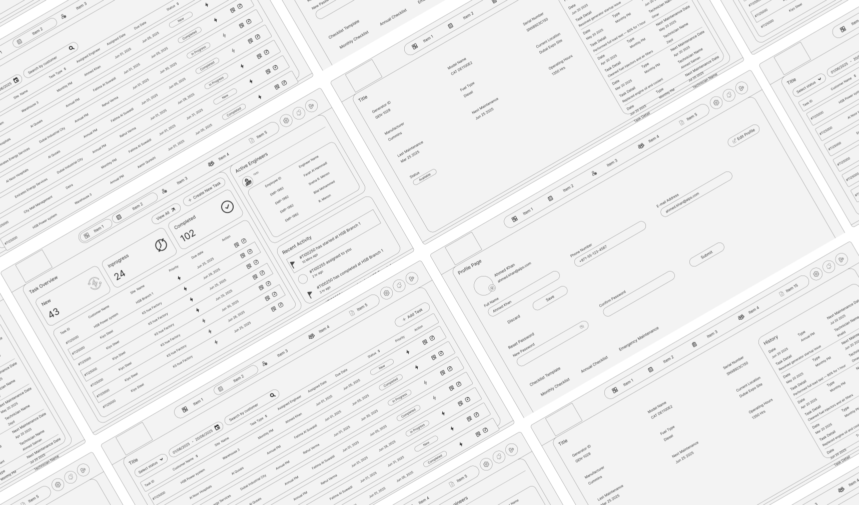
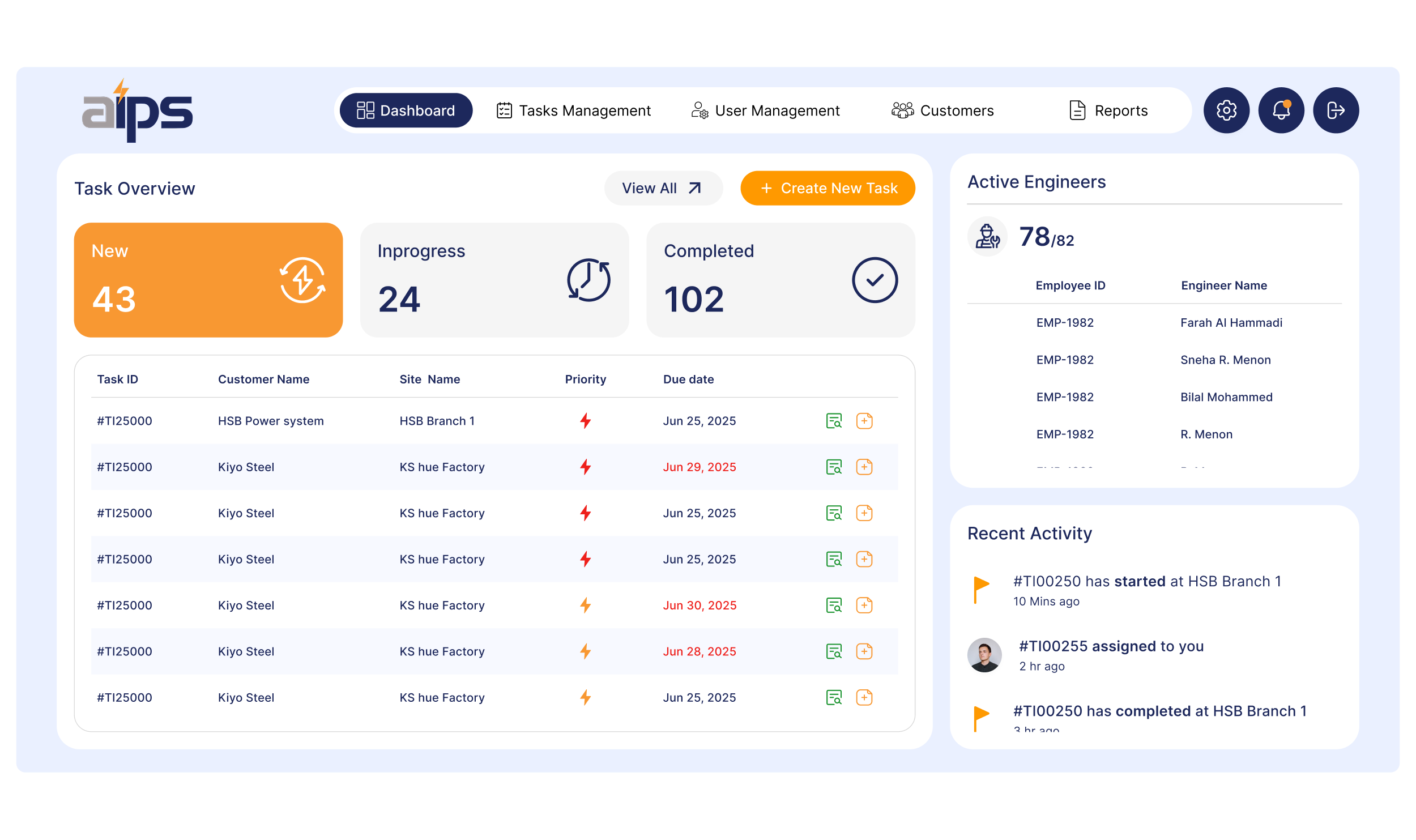
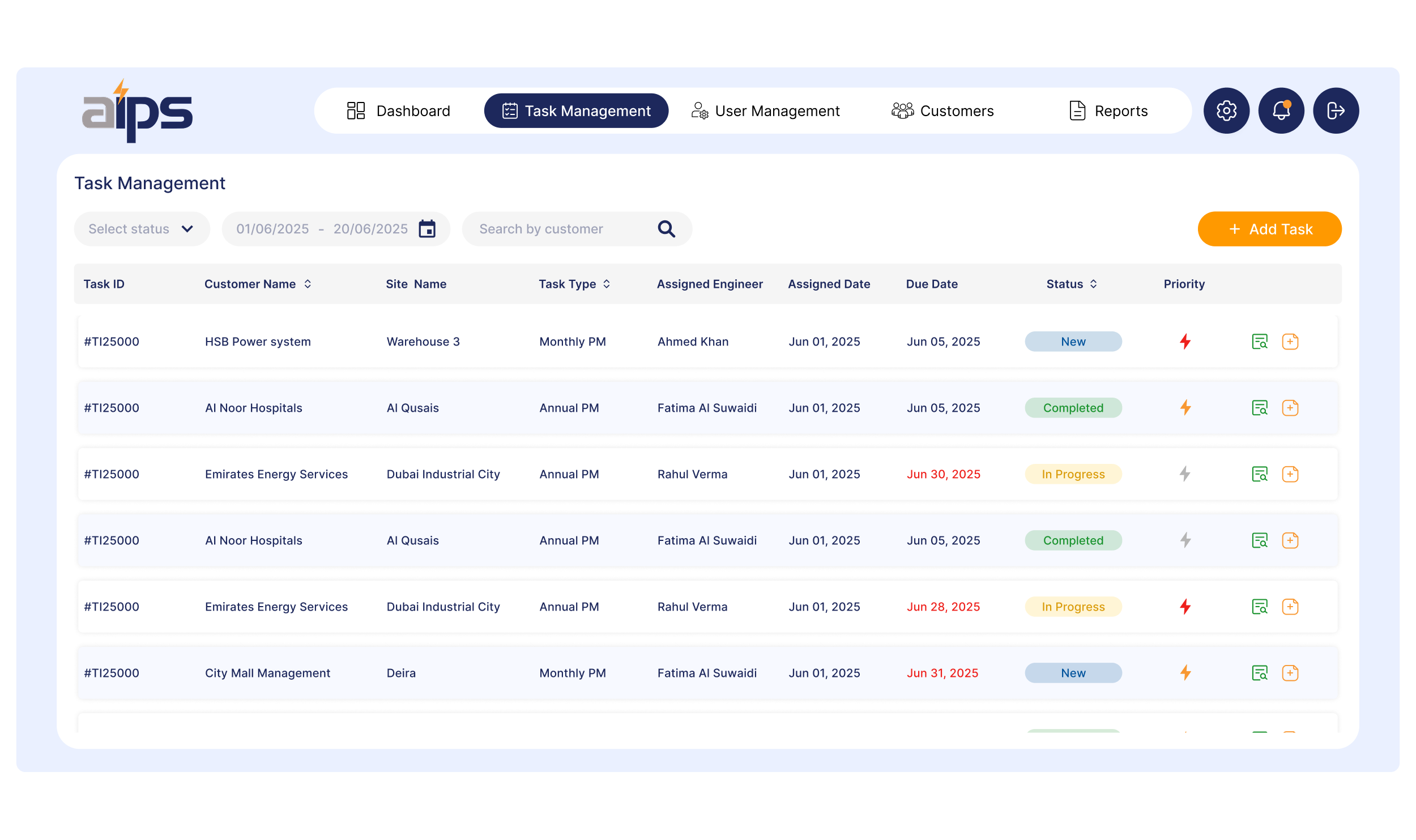
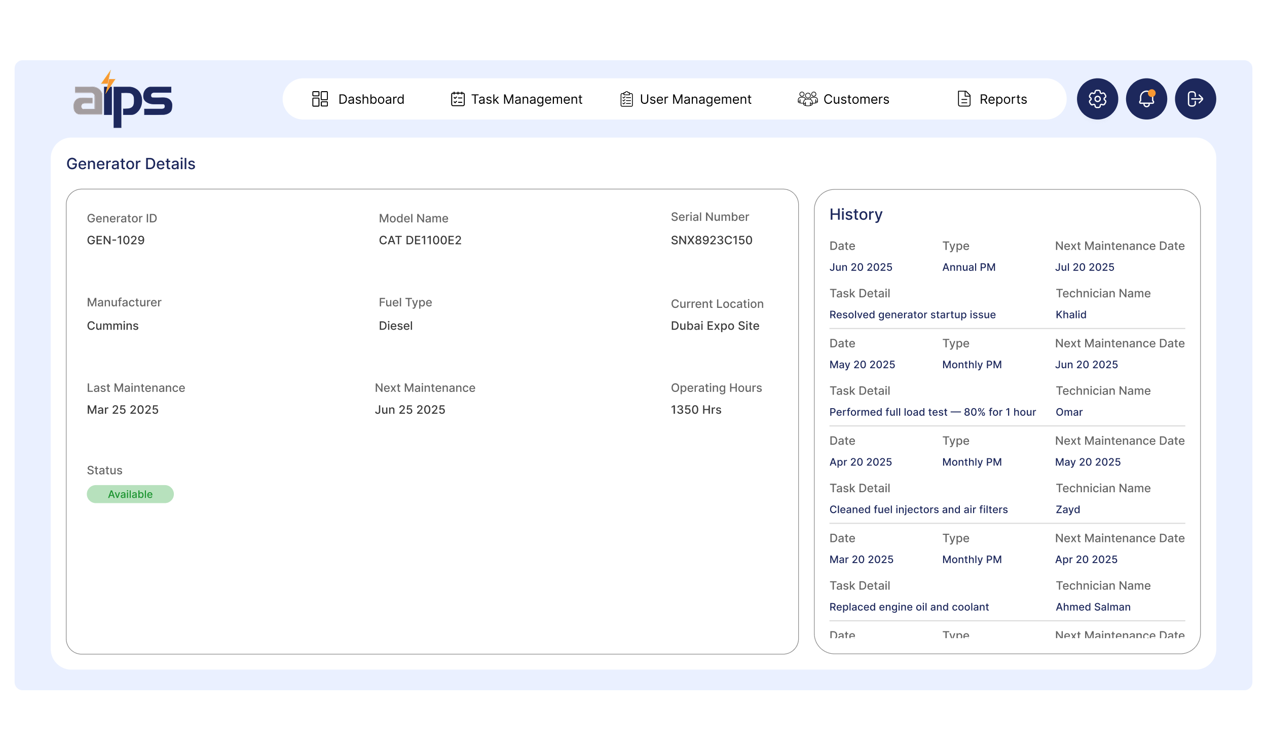
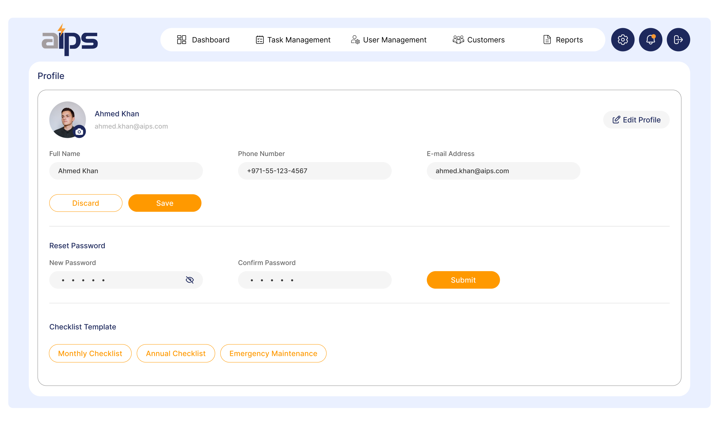
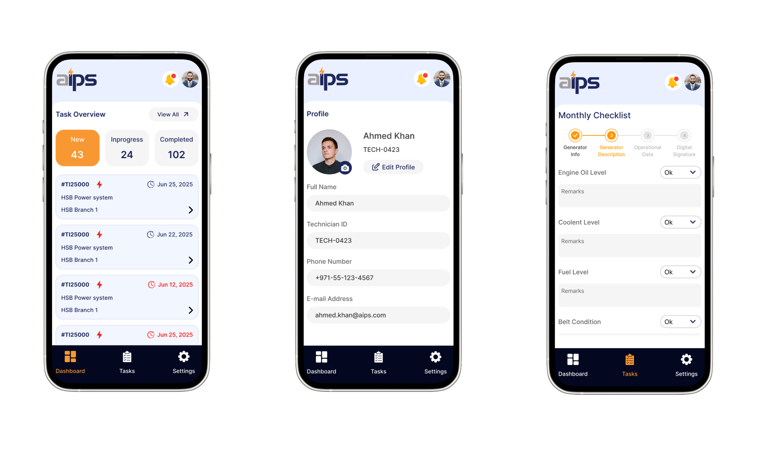
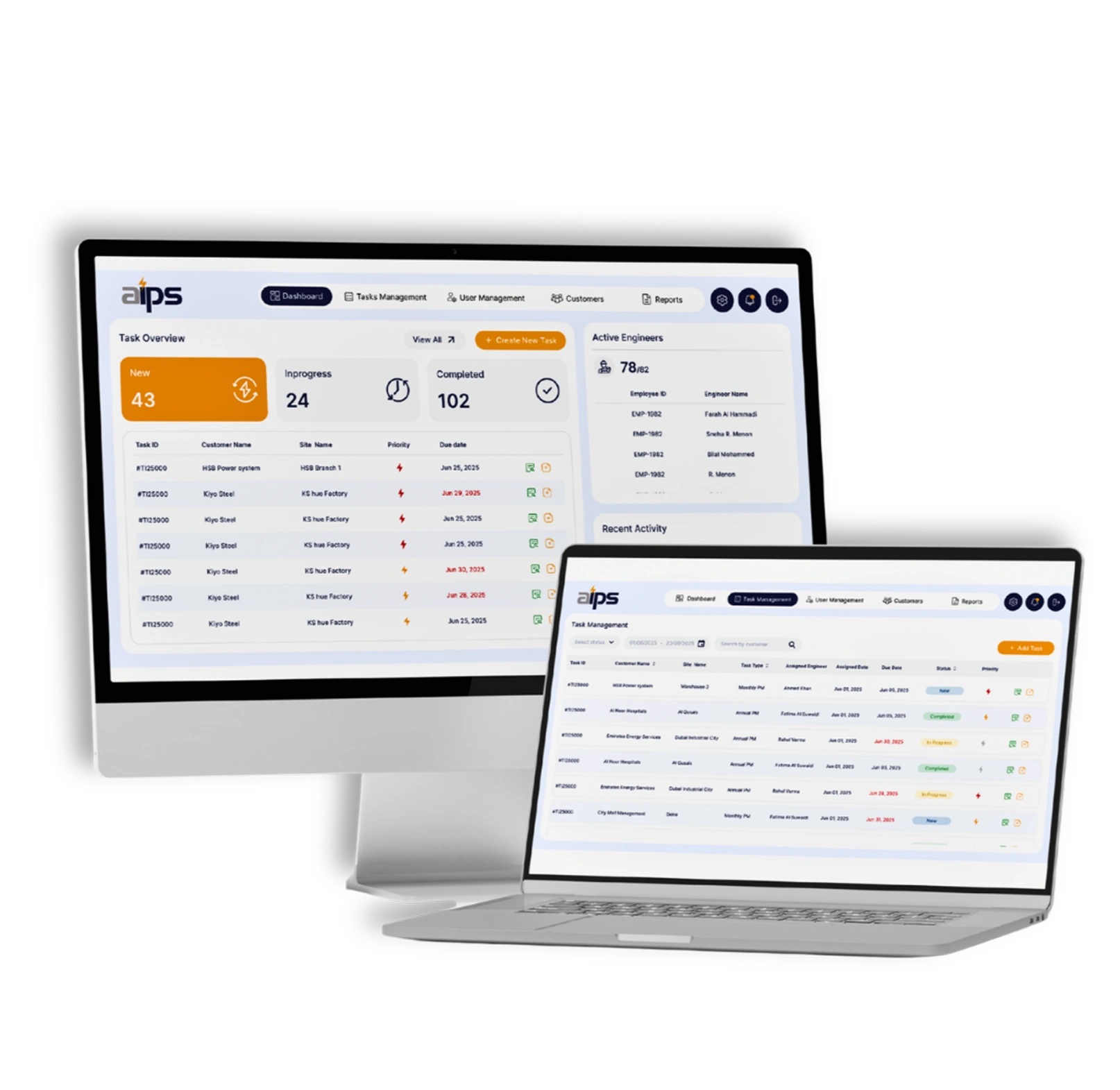
Introduced a refreshed design system with a professional color palette that conveys trust and security.

Simplified navigation flows with clear menus and intuitive pathways.

Enhanced dashboards with structured layouts for quick visibility into compliance and access status.

Applied responsive design principles for consistent experiences across desktop and mobile.

Our Process

We follow a user-centric approach—starting with research and wireframes, progressing through high-fidelity designs, and ending with interactive prototypes. Every step is focused on creating intuitive, impactful digital experiences.

01

User Flow Planning

Mapped buyer and seller journeys to ensure smooth navigation for product search, comparison, and inventory management.

02

Wireframes

Created low-fidelity wireframes to define the layout for dashboards, product listings, and comparison modules

03

High-Fidelity

Designed clean, intuitive interfaces focused on usability for both buyer-facing and supplier-facing web screens.

04

Prototype

Developed clickable prototypes to test flows like product search, comparison, and seller product uploads before development.

Low-Fidelity

Quick, sketch-style layouts focused on structure and user flow. These wireframes help visualize content placement and screen hierarchy during the early design phase.

Style Guide

The visual identity for AIPS is built around trust, professionalism, and clarity. Deep Navy (#1D285C) serves as the foundation, representing reliability, expertise, and confidence. Vibrant Orange (#F89832) adds energy and focus, drawing attention to key actions and important information. Soft Blue (#EAF0FF) introduces a sense of openness and calm, helping create a clean and approachable user experience. Light Gray (#F5F5F5) provides balance and neutrality, ensuring content remains clear, organized, and easy to navigate. Together, these colors create a modern and professional interface that enhances usability while reinforcing the brand’s credibility.

#1D285C

#F89832

#EAF0FF

#F5F5F5

Inter

Inter is a modern, highly legible sans-serif typeface designed for digital interfaces. Its clean geometry and balanced proportions make it ideal for both headings and body content. The font’s excellent readability ensures a smooth user experience across screens, helping maintain a consistent and contemporary visual tone throughout the platform.

Heading 1 - 32px Medium

Heading 2 - 20px

Heading 3 - 20px Medium

Body - 16px Regular

Hi-Fidelity

Polished, fully designed screens with colors, typography, and interactions. These mockups represent the final look and feel of the product, ready for prototyping or development.

Request A Consultation

Let’s build something great together!

Fill out the form below to get started—whether you need a free consultation, a quote, or want to kickstart your project!