Case Study - FitWell
Personalized Fitness Application
This fitness mobile application offers users personalized workout tips, video modules, diet plans, and timely reminders to stay on track. With recipe videos based on chosen ingredients, the app delivers a fully guided, interactive fitness and nutrition experience.
FitWell
- Challenges
The client struggled to present fitness content in an engaging yet structured way. Users found it difficult to follow inconsistent workout flows and lacked personalized dietary guidance. The absence of reminders led to poor routine adherence and low user retention.
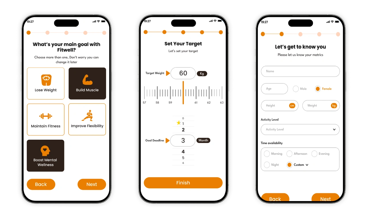
The platform also needed to cater to diverse user goals—such as weight loss, muscle gain, or maintenance—while delivering accessible, on-demand video content. A seamless way to integrate meal planning with ingredient-based filtering was also missing.
- Solutions
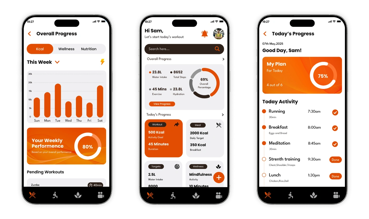
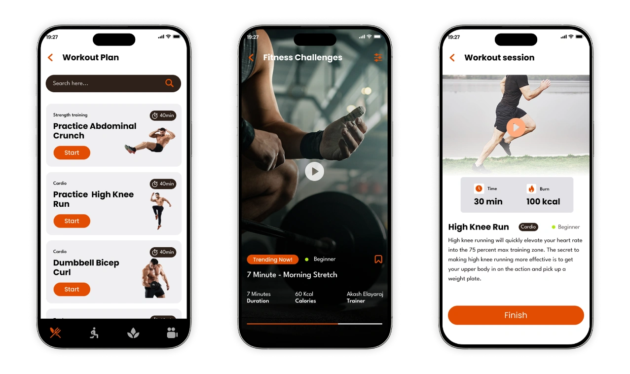
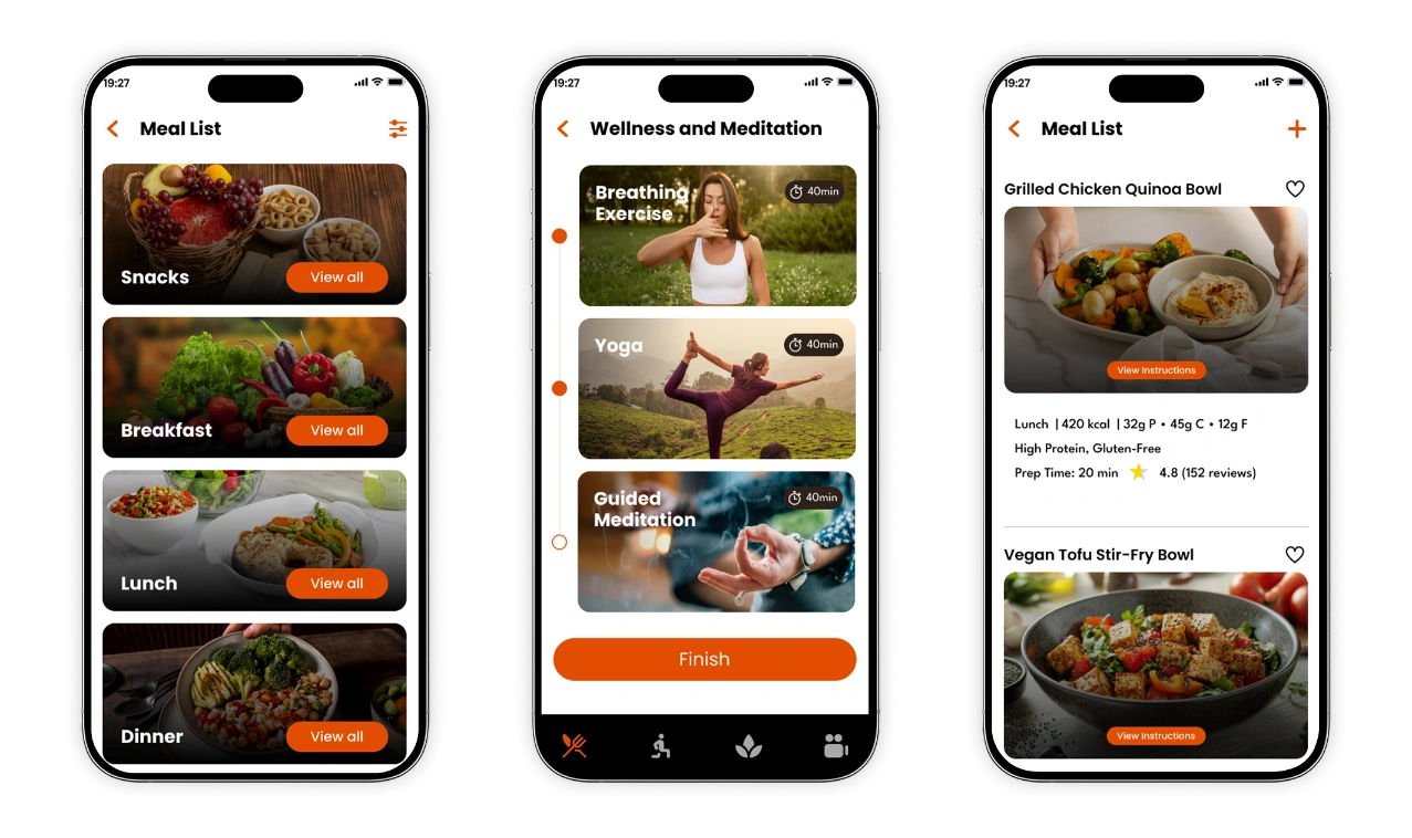
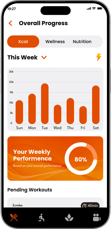
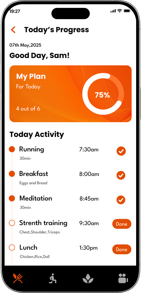
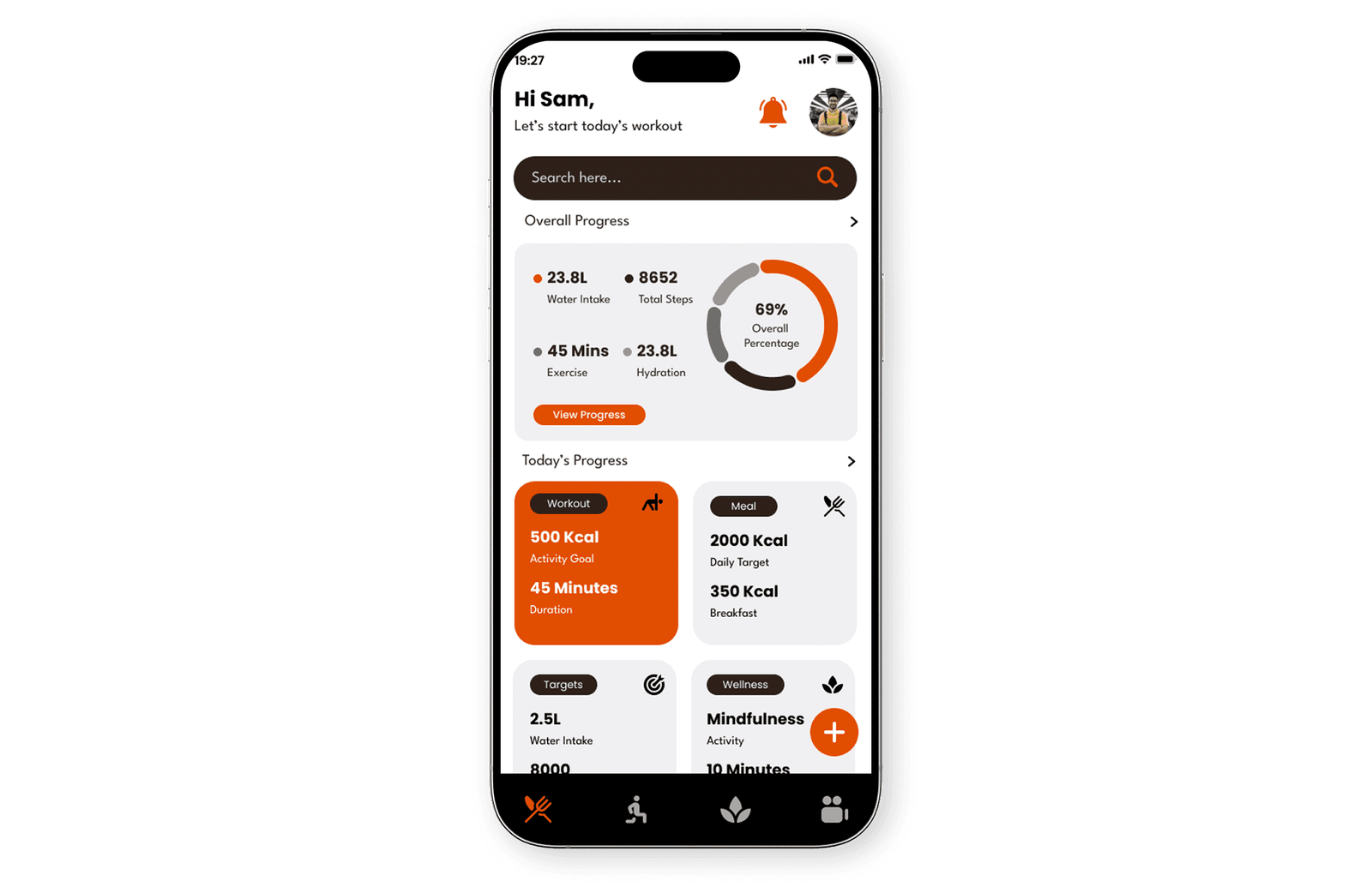
We crafted a clean, user-friendly mobile interface that seamlessly integrates fitness videos, personalized diet plans, and reminder notifications. The intuitive design allows users to navigate their daily routines effortlessly—accessing workouts, tracking meals, and exploring recipes based on selected ingredients.
Smart filters, responsive layouts, and goal-based personalization enhance usability and engagement. With guided training modules, step-by-step meal videos, and well-timed reminders, the app delivers a motivating and accessible fitness experience tailored to every user’s lifestyle.
Our Process
We follow a user-centric approach—starting with research and wireframes, progressing through high-fidelity designs, and ending with interactive prototypes. Every step is focused on creating intuitive, impactful digital experiences.
01
User Flow Planning
Mapped buyer and seller journeys to ensure smooth navigation for product search, comparison, and inventory management.

02
Wireframes
Created low-fidelity wireframes to define the layout for dashboards, product listings, and comparison modules
03
High-Fidelity
Designed clean, intuitive interfaces focused on usability for both buyer-facing and supplier-facing web screens.
04
Prototype
Developed clickable prototypes to test flows like product search, comparison, and seller product uploads before development.
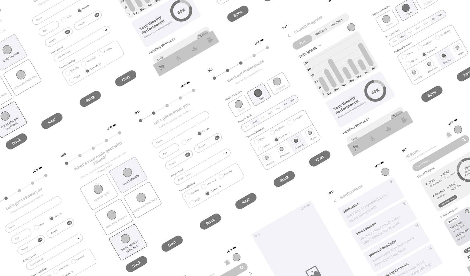
Low-Fidelity
Quick, sketch-style layouts focused on structure and user flow. These wireframes help visualize content placement and screen hierarchy during the early design phase.
Style Guide
The color palette features a dynamic Orange (#EA7E00) to represent energy, enthusiasm, and movement—perfect for a fitness-focused platform. It’s paired with a deep Black (#254400) to provide strong contrast, visual balance, and enhance content readability, ensuring the interface remains bold yet easy on the eyes.
#EA7E00
#254400
#FFD4BD
#2E211A
#E6E6E6
Poppins
League Spartan
We chose the Poppins typeface for its modern, geometric design and excellent legibility across various screen sizes. Its clean and minimal style supports a user-friendly experience, allowing users to quickly scan workout instructions, dietary plans, and reminders with clarity and ease.
We paired it with League Spartan for headings and highlights, adding boldness and strong visual hierarchy. Its sharp, contemporary character brings emphasis and energy to key sections, ensuring content remains engaging and easy to navigate.
Heading 1 - 32px
Heading 2 - 26px
Body - 16px
Hi-Fidelity
Polished, fully designed screens with colors, typography, and interactions. These mockups represent the final look and feel of the product, ready for prototyping or development.