Case Study - Price Me Up (PMU)
Vendor Management Portal
Price Me Up (PMU) is a price comparison platform tailored for the building and construction industry. It connects buyers with competitive prices from both large retailers and local suppliers, offering a broader market reach and a fairer playing field for smaller businesses.
Price Me Up, UK
- Challenges
The client faced difficulty in creating visibility for smaller, independent construction suppliers who lacked digital infrastructure. Many local vendors didn’t have online catalogs or the tools to showcase their pricing competitively, which made it hard to aggregate their data alongside large retailers.
Additionally, the client struggled with building a system that could handle dynamic price updates, standardize inconsistent product data, and serve both tech-savvy buyers and offline-first sellers. Ensuring that both user groups could interact with the platform effortlessly—without overwhelming smaller suppliers—was a critical challenge from the client’s side.
- Solutions
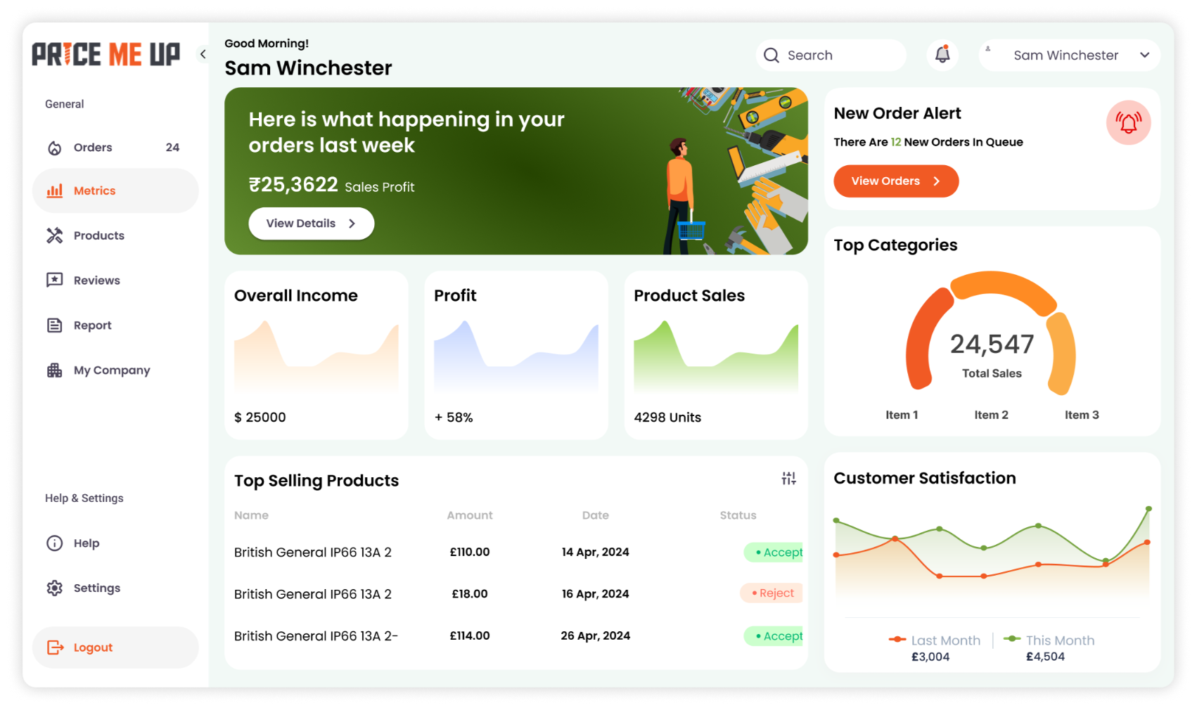
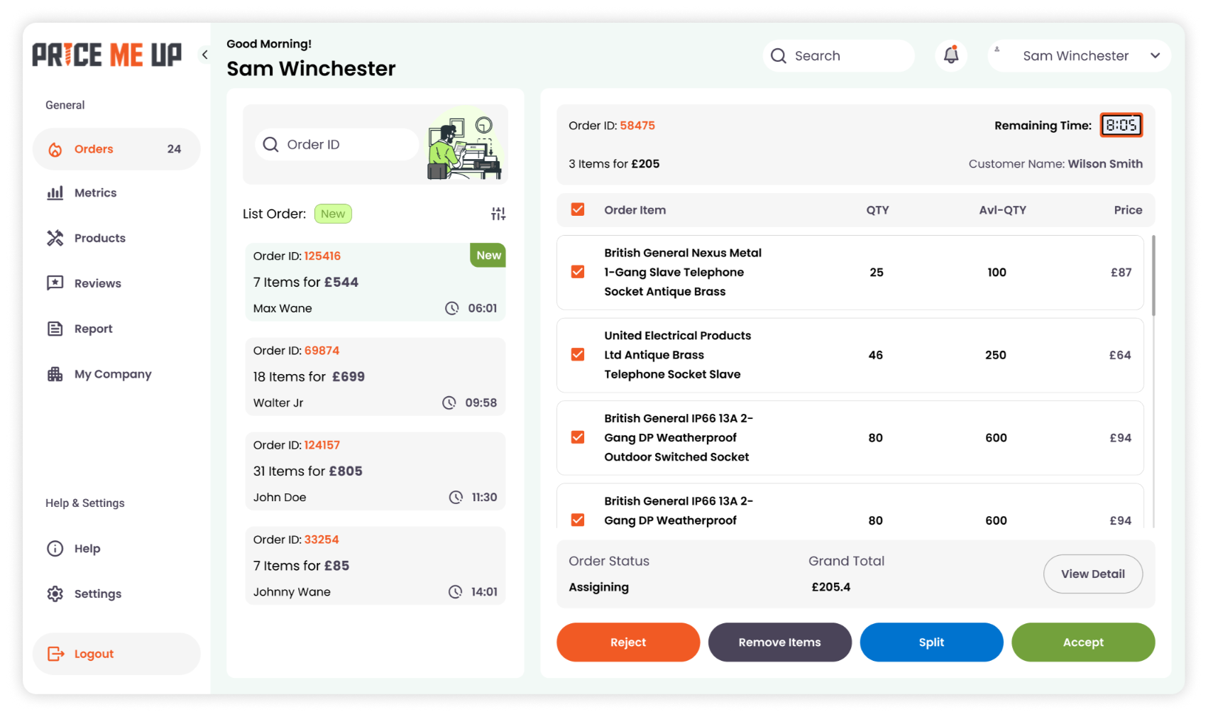
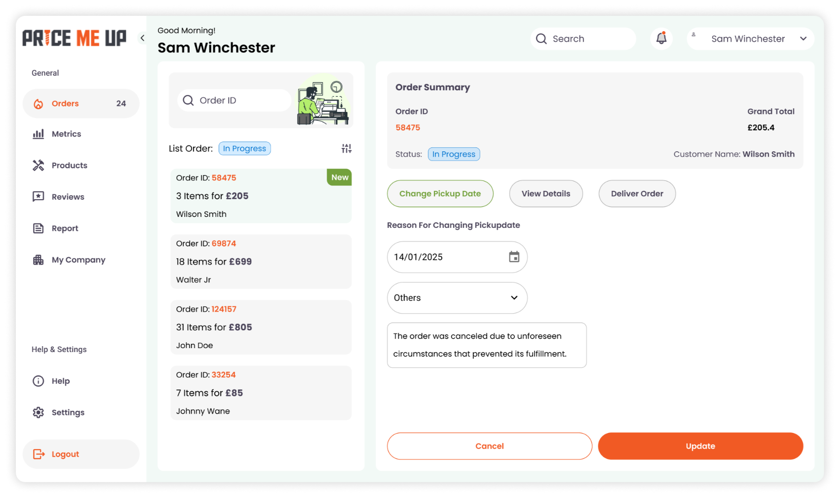
We designed a vendor-facing interface that enables local construction suppliers to easily upload and manage product listings. The system was built with simplicity and clarity in mind, allowing vendors—many with limited digital experience—to update prices, inventory, and product details effortlessly.
This vendor-side platform forms the operational core of PMU, ensuring accurate and real-time data flows into the customer-facing comparison tool. Our focus was on creating a clean, efficient B2B support system that empowers suppliers and enhances visibility for better customer decision-making.
Our Process
We follow a user-centric approach—starting with research and wireframes, progressing through high-fidelity designs, and ending with interactive prototypes. Every step is focused on creating intuitive, impactful digital experiences.
01
User Flow Planning
Mapped buyer and seller journeys to ensure smooth navigation for product search, comparison, and inventory management.


02
Wireframes
Created low-fidelity wireframes to define the layout for dashboards, product listings, and comparison modules
03
High-Fidelity
Designed clean, intuitive interfaces focused on usability for both buyer-facing and supplier-facing web screens.


04
Prototype
Developed clickable prototypes to test flows like product search, comparison, and seller product uploads before development.
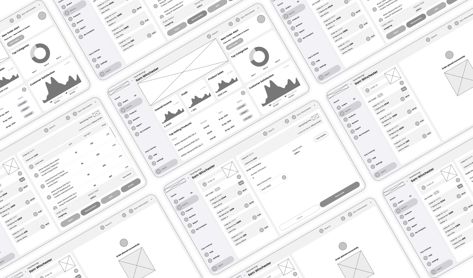
Low-Fidelity
Quick, sketch-style layouts focused on structure and user flow. These wireframes help visualize content placement and screen hierarchy during the early design phase.
Style Guide
PMU uses a vibrant Orange (#F15A24) to represent energy, urgency, and competitive pricing—core values of the platform. It’s complemented by a grounded, natural Green (#73A13C) that conveys trust, balance, and growth. Together, the palette creates a visual identity that is bold yet approachable, guiding users through key actions while maintaining a sense of reliability.
#F15A24
#254400
#4A4459
#B2B2B2
#F6F6F6
Poppins
The Poppins typeface complements the platform’s modern and functional approach. Its clean, geometric style ensures high readability for both product listings and interface elements, creating a consistent and user-friendly experience for buyers and sellers alike.
Heading 1 - 48px
Heading 2 - 36px
Heading 3 - 24px
Body - 16px
Hi-Fidelity
Polished, fully designed screens with colors, typography, and interactions. These mockups represent the final look and feel of the product, ready for prototyping or development.