Website traffic is rising, but lead numbers stay the same. If this sounds familiar, you might need the best mobile-friendly website design services. An outdated mobile design can silently destroy lead generation and send hard-earned visitors away. Today, neglecting a mobile-first approach is no longer a minor setback; it’s a major obstacle that stands between you and success.
Your Website Feels Empty on Mobile
Think about this: a new customer finds your site using their phone, clicks with curiosity, and suddenly they’re struggling. Tiny text, slow loading times, and buttons too small to click, they give up and leave, frustrated. This problem, rooted in poor mobile user experience (UX), acts as a barrier between you and your audience. Search engines like Google take note and demote websites that are hard to use on mobile. This pushes you further down in search rankings and hides you from future leads.
Make It Personal: Wasted Investment, Lost Opportunities
Your marketing budget is precious. Every ad, every campaign, every search result is meant to bring someone closer to your business. But if your website is hard to use on a mobile device, your investment is wasted. People abandon your site before you even get a chance to speak to them. Your growth goals feel more and more out of reach, and the fantasy of a thriving business slips away. Frustration grows, leads dry up, and potential revenue is lost without a trace.
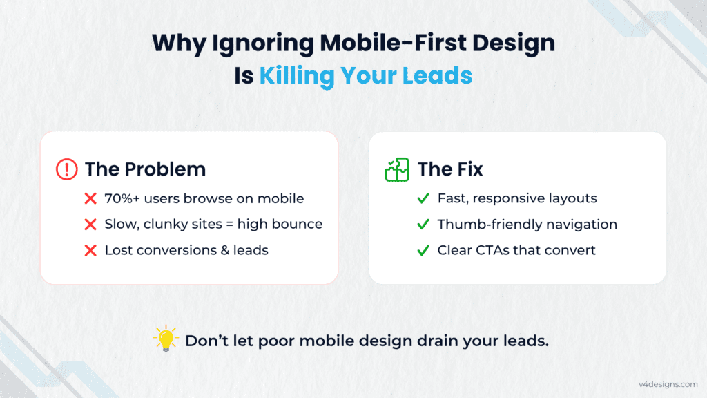
How to Find and Fix Your Mobile Problem
Addressing this challenge starts by understanding the importance of mobile-first design. Don’t confuse this with simple responsive web design. While responsive design adjusts a desktop site to smaller screens, a true mobile-first approach puts mobile users first, building upward from there.
How to Tell If Your Website Needs Help:
- Test Performance: Use Google’s Mobile-Friendly Test for an instant pass/fail on your mobile site.
- Check Analytics: Are mobile users bouncing quickly? This is a key warning sign.
- Try It Yourself: Open your website on your phone. Can you find what you need? Can you easily fill out a form or tap to call?
Simple Actions for Maximum Results
Want to know how mobile design impacts conversion? A seamless mobile experience turns visitors into leads. Here’s how to get there:
- Accelerate Loading: Mobile visitors are in a hurry. Compress images and simplify code to get your site under three seconds.
- Streamline Menus: Use clear, simple navigation, hamburger menus and visible search bars to make things easy.
- Design for Thumbs: Make all clickable elements easily tappable, with enough space to prevent mistakes.
- Simplify Forms: Short forms, autofill options, and big input fields help users complete actions effortlessly.
By focusing on mobile UX design and embracing mobile-first strategies, you will enhance your conversion rates and stop the loss of valuable leads.
Take Control: Partner with V4Designs
Stop letting your dream website remain a fantasy. Take a strategic leap with the best mobile-friendly website design services from V4Designs. Our expert team specializes in transforming struggle into success.
Whether you’re after the Best UI UX Design Services for Startups, comprehensive Website Redesign Services, or need the guidance of an SEO agency for startups, we’re your best partner. Searching for the Best Web Design company near me? Our reputation as a User Experience Design Company in India and a preferred User Experience Design Company in Coimbatore proves we can deliver.
V4Designs – Professional UI/UX Design & Web Development Agency is ready to help you capture more leads and maximize every visitor. Contact us today to start your journey toward a high-performing, user-driven website.
Don’t Miss: How to Make Your Website Load Fast Without Losing Aesthetics
FAQs
1. What’s the difference between responsive web design and mobile-first design?
Responsive web design adapts a desktop site for smaller screens, while mobile-first design builds for mobile devices first, then extends features to desktop. This delivers a better experience for the majority of users.
2. How does mobile UX design impact conversion rates?
Effective mobile UX means users can find info, fill out forms, and contact you easily, increasing conversions. A poor mobile experience leads to quick exits and fewer leads.
3. Why is mobile-first design so important for SEO?
Google prioritizes mobile-first indexing. If your site doesn’t work well on mobile, your search rankings suffer, limiting your reach to new customers.